Improving online event registrations: your 2026 guide

The single most effective way to increase online event registrations is to remove friction before it costs you sign-ups. Average form abandonment is high, and additional form fields reduce completion rates substantially. That means a 12-field registration form is not just inconvenient — it is actively losing you attendees who were ready to commit. The good news is that the fixes are concrete, measurable, and well within reach for any event organiser.
Here is what the evidence points to:
-
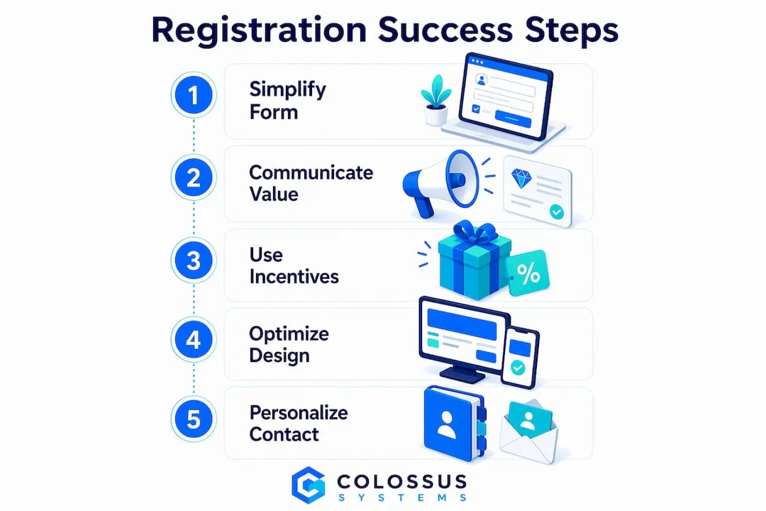
Limit required fields to just the essential information such as name, email, and ticket type.
-
Communicate event value clearly above the fold, before asking for any data
-
Use multi-step forms with progress indicators to reduce drop-off
-
Make phone numbers optional, as requiring this information can significantly increase abandonment rates.
-
Design for mobile first: single-column layouts, large tap targets, proper input types
-
Send personalised reminders referencing each registrant’s stated intent
-
Offer early-bird pricing and referral incentives to create genuine urgency
-
Track field-level abandonment and run A/B tests to find and fix friction points
The sections below go deeper on each of these, with the data and specific techniques to put them into practice.
How improving online event registrations starts with a simpler form
The registration form is where most sign-ups are lost, and the cause is almost always the same: too many fields, too much uncertainty, and too much effort on a phone screen.
- Cap required fields at 3–5. Name, email, and ticket type are the genuine minimum for issuing a ticket. Everything else — job title, company size, dietary preferences — can be collected via a follow-up email once the attendee has already committed.
- Use multi-step forms with a visible progress bar. Using multi-step forms with visible progress indicators can greatly improve conversions. People abandon when they cannot see the end.
- Make phone numbers optional. When a phone field is mandatory, 37% of registrants leave. If you need a number for SMS reminders, ask for it after the ticket is confirmed.
- Add inline validation. Real-time error feedback — a green tick when an email is valid, a clear message when it is not — increases completion by 22% compared to forms that only flag errors on submission.
- Design mobile-first. Single-column layout, tap targets of at least 48px, and the correct keyboard type for each field (email keyboard for email, number pad for phone) are non-negotiable when more than half of registrations happen on phones.
- Never force account creation. Requiring a password before registration is one of the most reliable ways to kill a sign-up. Offer guest checkout first; invite account creation afterwards as a convenience.
- Use conversational, branching flows. Conversational registration — where attendees answer one question at a time and irrelevant questions are hidden automatically — improves completion by 15–25 points for warm traffic and feels like a chat rather than a tax return.
Pro Tip: Open your conversational flow with the lowest-commitment question possible — something like “Which day works better for you?” rather than “What is your email?” That single change has driven conversion lifts of 15–25 points by getting attendees moving before they have committed to anything.

How to communicate event value so attendees actually want to register
The silent reason most people leave a registration page without signing up is doubt. They are asking themselves: “Is this worth my time and money?” Your page needs to answer that question before they even reach the form.
- Lead with the what, when, why, and where above the fold. Attendees should not have to scroll to find the date, format, location, and core benefit of attending. Specificity is itself a trust signal.
- Display social proof prominently. Registration counts (“Join 487 registered attendees”), partner logos, and photos from past events all tell a prospective attendee that others have already made this decision. Displaying registered attendee counts and limited availability creates both trust and urgency.
- Show the full price upfront. Hidden fees discovered at the payment step are a top abandonment cause. If there is a service charge, state it before the form. Price transparency is not just good practice — it is expected.
- Highlight speakers, agenda highlights, and tangible outcomes. Attendees justify their time and budget by knowing who is speaking and what they will leave with. Release this information early; waiting until the last minute means potential registrants have already committed elsewhere.
- Include trust signals throughout. A visible refund or cancellation policy, secure payment icons, and a recognisable host name answer the quiet doubts that cause people to close the tab. For building trust online, specificity matters more than polish.
- Frame messaging around value, not just the event name. “Learn how to cut your reporting time by half” outperforms “Annual Finance Summit” as a headline every time.
Using incentives and perks to increase registrations
Urgency and incentives work because they give hesitant prospects a concrete reason to act now rather than later. The key is making them truthful and time-bound.
- Offer tiered early-bird pricing. A super early-bird rate (limited quantity, deepest discount) rewards your most committed audience; a standard early-bird rate (time-limited) creates a deadline for everyone else. Each tier generates a natural spike in registrations as its deadline approaches.
- Create referral perks. Equipping registered attendees with a personalised sharing link — and rewarding them when a colleague signs up — turns your existing registrants into a promotional channel. Peer referrals carry far more weight than branded content.
- Display countdown timers and registration milestones. “Only 23 early-bird tickets left” and “500 professionals already registered” combine scarcity with social proof. Use these truthfully; false urgency destroys the trust you have worked to build.
- Write benefit-led button copy. “Save my spot” and “Get my free ticket” consistently outperform generic “Register” buttons because they remind the attendee what they are gaining, not just what they are doing.
- Send personalised reminders referencing registrant goals. If you captured why someone registered, your reminder can reference that intent directly. Generic “Don’t forget — event tomorrow” emails perform far worse than messages tied to what the attendee said they wanted to achieve.
What good registration software and web design actually look like
Technology choices shape the attendee experience long before anyone reaches the form. The right platform removes friction by design; the wrong one creates it at every step.
- Choose a platform that supports conversational or multi-step forms. Static, single-page forms with ten or more fields are a structural problem that no amount of copywriting can fix. Look for platforms that support conditional logic, branching, and dynamic question hiding.
- Prioritise mobile optimisation. Mobile-optimized forms lead to higher conversion rates. Single-column layouts, 48px minimum tap targets, and correct input types are the baseline, not a bonus feature.
- Enable autofill for common fields. Browser autofill removes typing entirely for returning visitors. For email and name fields, this alone meaningfully reduces drop-off on mobile.
- Keep load times fast. Slow step transitions and page reloads between form steps cause abandonment. Aim for instant transitions and a page that loads in under 2.4 seconds.
- Show price and progress simultaneously. A visible progress bar tells attendees how close they are to finishing; a visible price total removes the sticker-shock moment at checkout. Both reduce the “how long is this?” anxiety that drives abandonment.
- Integrate with payment gateways and your event management tools. A registration platform that connects directly to your CRM, email marketing system, and payment processor means attendee data flows automatically, reducing manual work and the risk of errors. Colossus’s event management software is built with these integrations in mind, keeping your registration and member data in one place.
- Remove exit ramps near the form. A navigation bar full of links beside your registration step is an invitation to wander off. Minimal chrome around the checkout keeps focus on completing the sign-up.
How personalised communication before your event reduces no-shows
Registration is not the finish line. A significant share of registrants — particularly for free events — will not attend unless you keep them engaged between sign-up and event day.
- Start communication 6–8 weeks out with a save-the-date. Structured communication sequences starting this far in advance build momentum and reduce last-minute drop-off. Early awareness gives attendees time to protect the date in their calendars.
- Segment and personalise your invites and reminders. A sponsor, a speaker, and a general attendee need different messages. Conditional-logic platforms make this straightforward; sending the same email to everyone is a missed opportunity.
- Send a reconfirmation email 24–48 hours before the event. Reconfirmation emails cut no-shows by roughly 30%, but only when they reference what the registrant said they wanted to get from the event. A generic reminder does not carry the same weight.
- Include calendar links in your confirmation email. An add-to-calendar button in the immediate confirmation email means the event lives where attendees actually look. This single step meaningfully reduces no-shows.
- Encourage social sharing after registration. Equipping attendees with a branded, personalised sharing card for LinkedIn turns them into advocates. Their network sees a peer endorsement, which drives awareness and further sign-ups cost-effectively.
- Use post-registration surveys to capture intent. Asking “What do you most want to get out of this event?” gives you the data to personalise every subsequent message. It also signals to the registrant that you are paying attention to their goals, not just their email address. For more on pre-event engagement strategies, Colossus covers this in depth for membership organisations.
What the data says about form abandonment and registration drop-off
The numbers behind registration drop-off are more precise than most organisers realise, and they point clearly to where the fixes should go.
- Form abandonment averages 68–70% across online event registrations, with each extra field reducing completion by 4–11%.
- Inline validation can significantly increase form completions by providing immediate feedback.
- Paid events see no-show rates near 10%; free events see rates close to 50%. Even a nominal deposit shifts attendee commitment significantly.
- Reconfirmation emails reduce no-shows by roughly 30% when they reference the registrant’s stated intent.
- Conversational registration flows improve conversions by 15–25 points for warm traffic compared to static multi-field forms.
- Tracking time-to-complete and field-level abandonment reveals exactly where registrants are dropping off. Free-text questions typically complete at 89%+, while dropdown fields for company size complete at 72–78%.
- Capturing registrant intent at sign-up — one open question about what they want to achieve — is the single lever that makes personalised reminders possible and drives the no-show reduction above.
The pattern is consistent: shorter, smarter forms combined with intent capture and structured follow-up produce measurably better outcomes than longer forms and generic reminders.
How A/B testing helps you find what actually works for your registrants
Opinion about what converts better is cheap. A/B testing turns that opinion into evidence, and for registration pages, the gains from even a single well-run test can be substantial.

The discipline is straightforward: change one element, split your traffic between the two versions, and keep whichever converts better. The elements worth testing first are the ones with the highest documented impact.
Start with field count. Fewer fields almost always win, but testing tells you exactly how many your specific audience will tolerate before dropping off. Reducing from 11 fields to 4 produced a 120% increase in conversions in one documented case — your numbers will differ, but the direction is reliable.
Test button copy next. “Register” versus “Save my spot” versus “Get my free ticket” can produce meaningfully different results. Specific, first-person, benefit-led copy tends to outperform generic verbs, but the winning version depends on your audience and event type.
Try different headline framings. Benefit-first (“Leave knowing how to halve your reporting time”) versus event-name-first (“Annual Finance Summit 2026”) is a high-value test because the headline is the first thing every visitor reads.
Test social proof placement. Attendee counts and partner logos above the form versus below it, or in the hero section versus beside the submit button, can shift conversion rates without changing the form itself.
Track the right metrics throughout. Registration rate (visitors to completions), time-to-complete, and field-level abandonment all tell you different things. A drop in time-to-complete after removing a field confirms the field was friction, not value. Colossus’s analytics and CRM tools give membership organisations the attendee-level data needed to run these tests and act on the results.
Pro Tip: For a flagship annual conference, run the new version as a parallel option for the first month rather than replacing your existing form entirely. Promote it explicitly (“Register in under 90 seconds”) and compare conversion and post-registration sentiment before rolling it out to all traffic.
How Colossus helps membership organisations manage registrations end to end
Colossus is built for membership organisations, associations, and nonprofits that need event registration, member management, CRM, and email marketing to work together rather than in separate tools. Our event management software supports customisable registration workflows, integrated payment processing, and the attendee data capture that makes personalised follow-up possible at scale.
If your organisation is ready to move beyond manual processes and disconnected platforms, explore the full range of Colossus features to see how we bring registration, engagement, and member management into one place.
Key takeaways
Improving online event registrations comes down to removing friction at the form, communicating value before asking for data, and following up with personalised communication that keeps registrants committed through to event day.
| Point | Details |
|---|---|
| Limit form fields | Cap required fields at 3–5; each extra field drops completion by roughly 11%. |
| Use multi-step forms | Adding a progress bar lifted one form’s conversion from 11% to 46% in a documented test. |
| Make phone optional | 37% of registrants abandon when a phone number is mandatory; make it optional with a clear explanation. |
| Reconfirm before the event | A reconfirmation email 24–48 hours out reduces no-shows by roughly 30% when it references stated intent. |
| A/B test one element at a time | Test field count, button copy, and headline framing separately to isolate what actually drives your conversions. |